The U.S. Department of Commerce within the White House announced the creation of 31 “Tech Hubs”. Out of these 31 tech hubs, two departments within Oregon State were chosen to represent them, one being the Corvallis Microfluidics Tech Hub. CorMic, as it’s often referred to as, reached out needing a Logo to represent their organization. The problem involved finding an appropriate visual solution to their not so visual science, Microfluidics.
CorMic tasked me with visually representing the science of microfluidics, combined with elements of Oregon’s landscapes or the essence of Corvallis and Benton County. We explored multiple directions, each offering unique solutions.
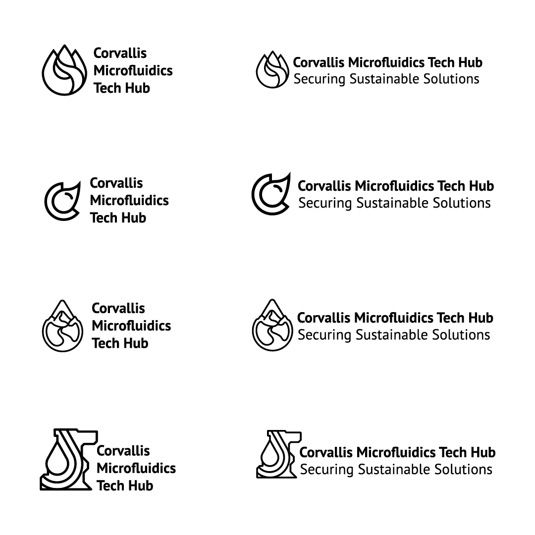
Four designs were selected for further development, each capturing different aspects of the microfluidics concept. We then refined these designs by exploring various typography options to ensure the final logo was both visually cohesive and effectively communicated CorMic's identity.
With the final design in place, we moved on to conceptualizing the color palette. We selected blue to symbolize fluidity and green to reflect Oregon’s natural landscape and CorMic’s commitment to sustainability.
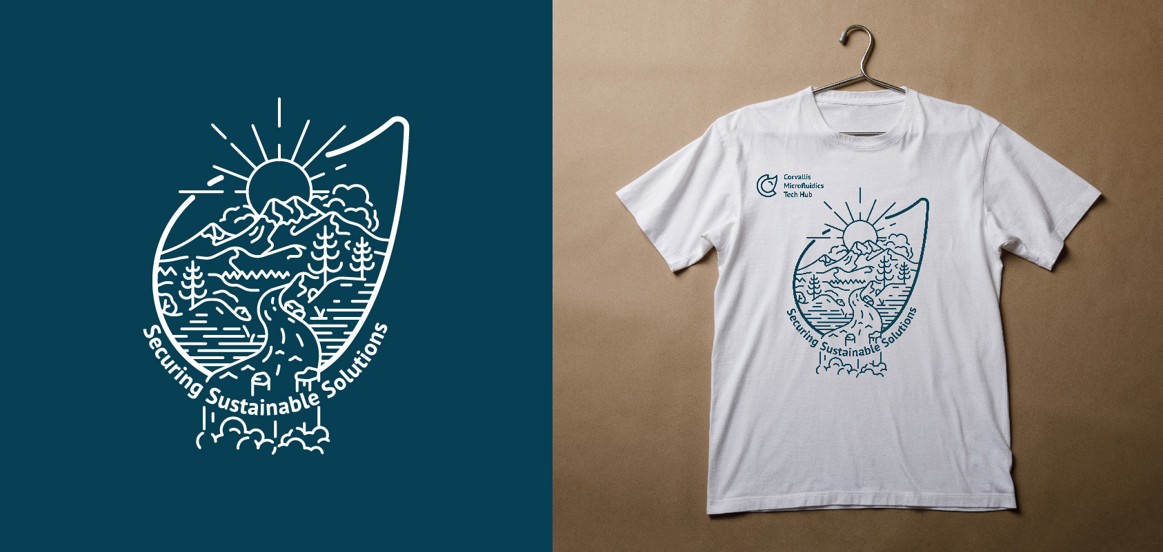
A few months after finalizing the logo and brand, CorMic approached me again to design a T-shirt. We decided to integrate a more outdoors-inspired illustration within the droplet shape of their logo, further connecting their brand to Oregon's natural landscape.
After exploring several T-shirt designs, we settled on a concept that integrated CorMic’s logo, mission statement, 'Securing Sustainable Solutions,' and an outdoor-themed illustration. The final design is cohesive and effectively represents CorMic’s commitment to innovation and sustainability.
Jake Fischer
Sharon Betterton
Jake Fischer