Corvallis Microfluidics Tech Hub · 2024
CorMic Logo & Brand
Roles
- Logo Design
- Identity
- Product Design
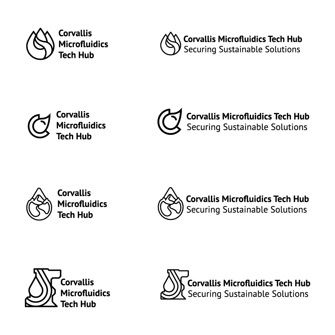
A visual identity for a federally designated Tech Hub — finding an approachable way to represent the not-so-visual science of microfluidics, rooted in Oregon's landscape.
The U.S. Department of Commerce announced the creation of 31 "Tech Hubs." Two departments within Oregon State were chosen — one being the Corvallis Microfluidics Tech Hub. CorMic reached out needing a logo to represent their organization. The challenge: find an appropriate visual solution for their not-so-visual science, microfluidics.
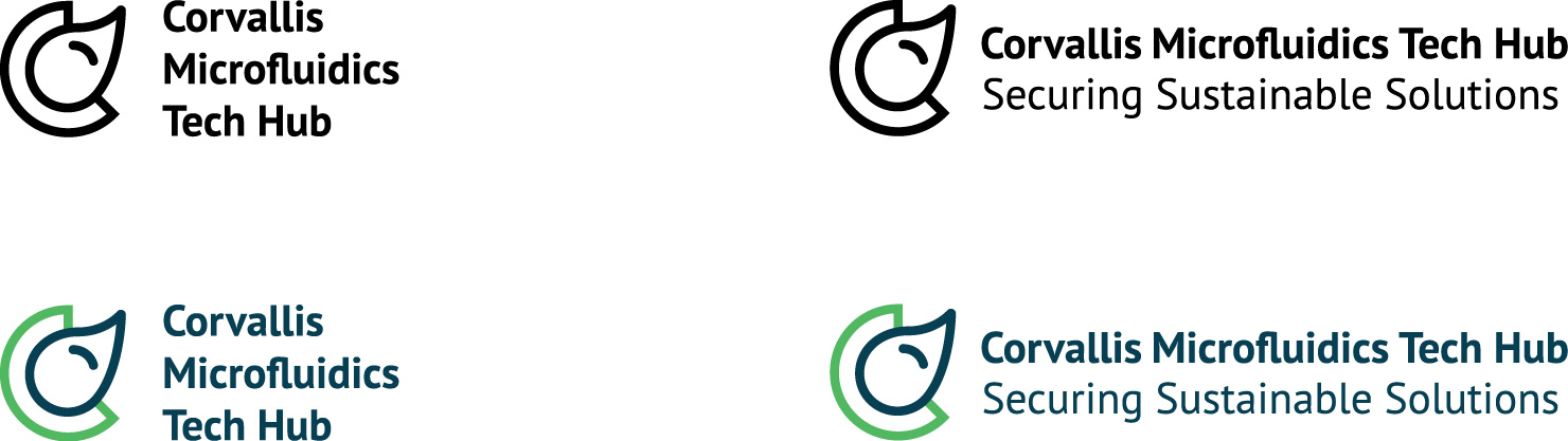
CorMic tasked me with visually representing microfluidics, combined with elements of Oregon's landscapes and the essence of Corvallis and Benton County. We explored multiple directions, each offering unique solutions.

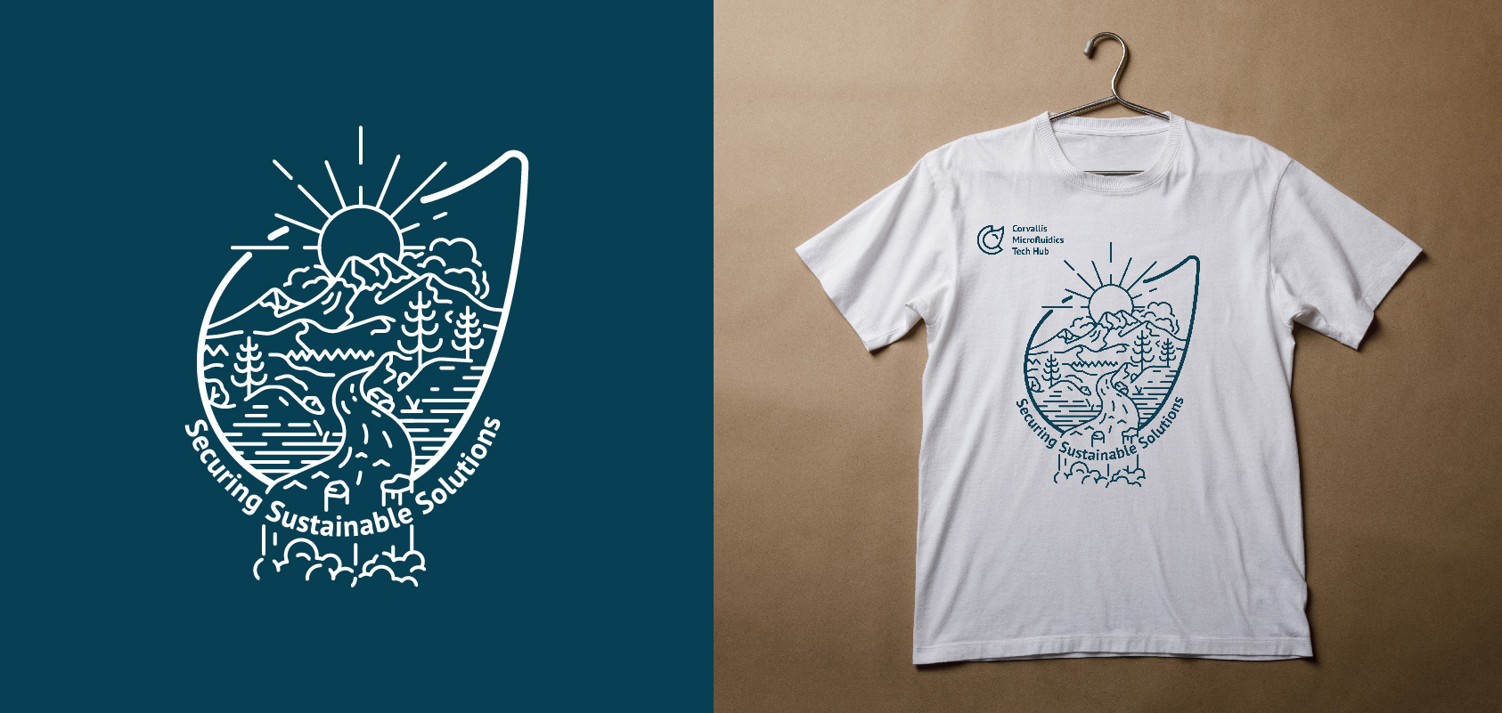
We selected blue to symbolize fluidity and green to reflect Oregon's natural landscape and CorMic's commitment to sustainability. A few months later, CorMic approached me again to design a T-shirt — integrating an outdoors-inspired illustration within the droplet shape of their logo.
Credits
- Logo & Product Design
- Jake Fischer
- Art Direction
- Sharon Betterton
Next project
College of Science Planner